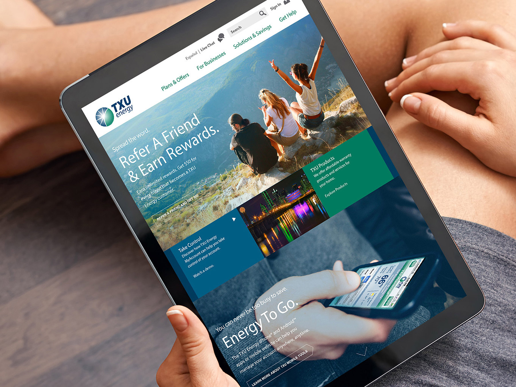
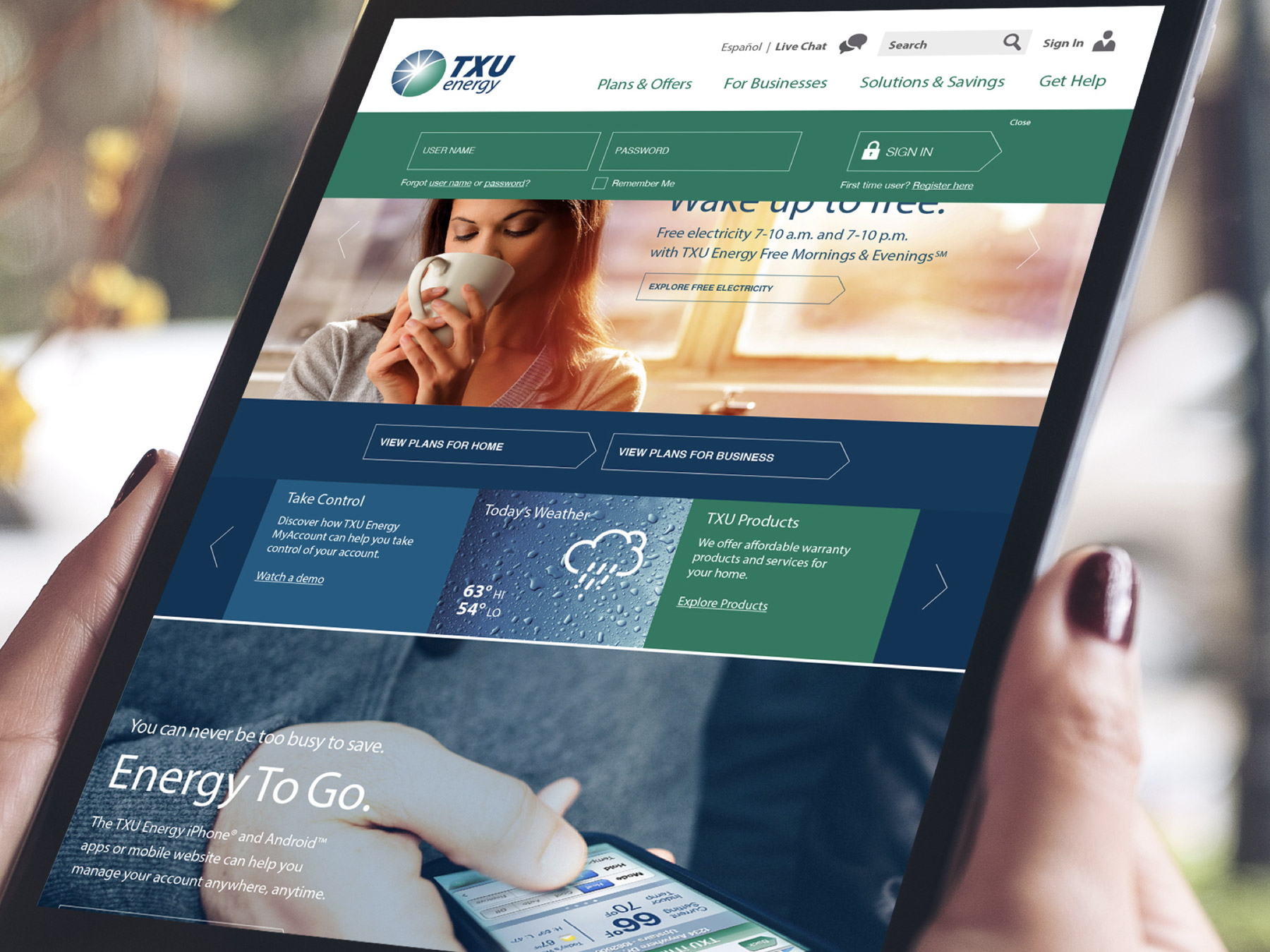
TXU Energy, the largest energy provider in the state of Texas, was long overdue in reimagining the website experience, both with homeowners in the consideration phase of the customer journey as well as creating useful tools and content for new and existing customers.
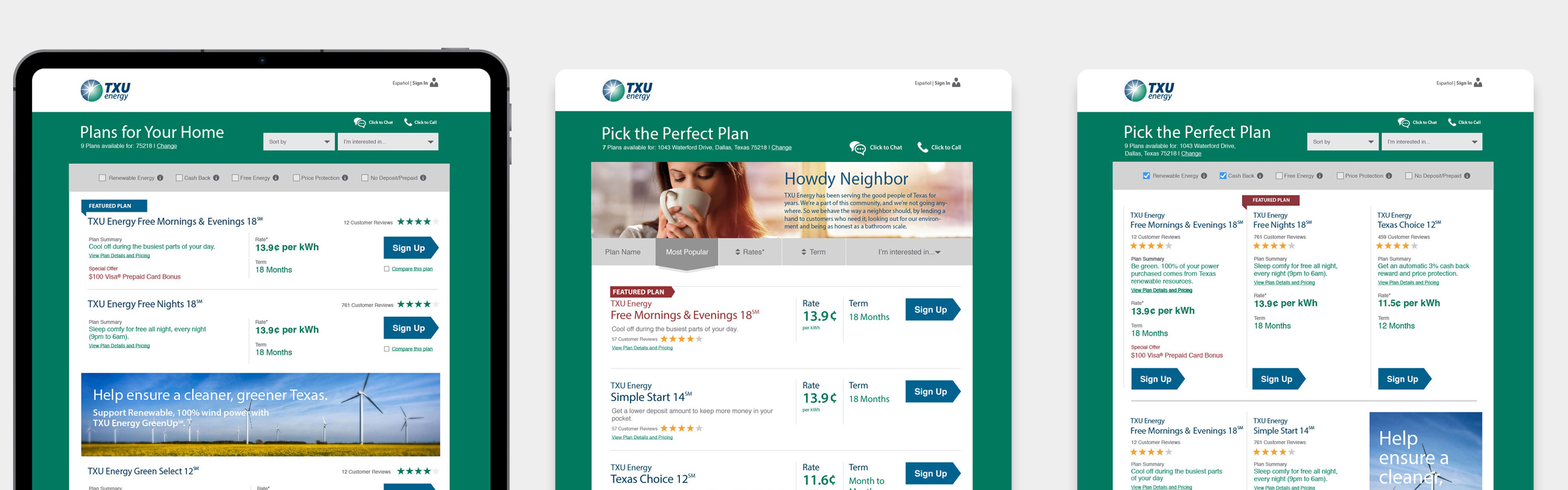
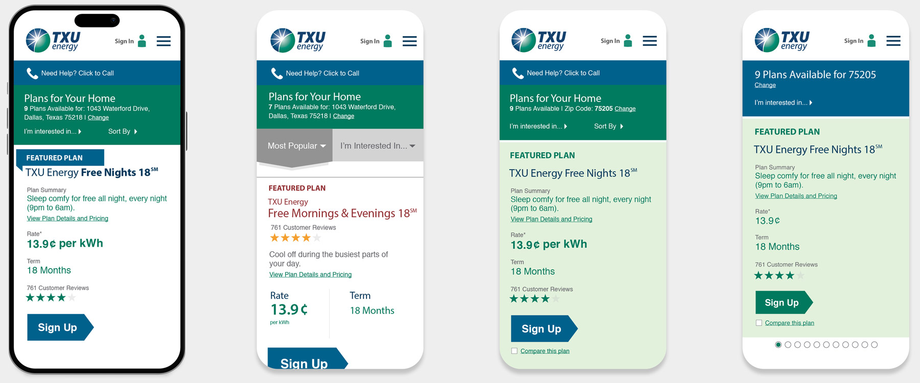
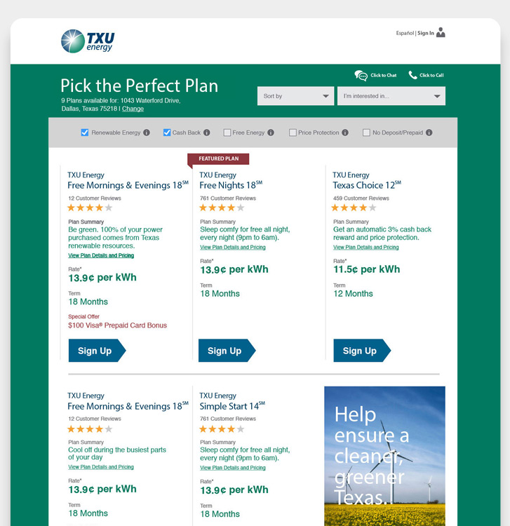
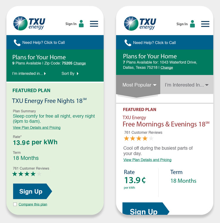
TXU was losing market-share in the ever-increasing online customer enrollment experience. To increase online sign-ups, TXU needed to streamline the enrollment process. There was an overwhelming amount of information needed by the customer which contributed to a high percentage of form abandonment.
TXU Energy
TXU Energy, the largest energy provider in the state of Texas, was long overdue in reimagining the website experience, both with homeowners in the consideration phase of the customer journey as well as creating useful tools and content for new and existing customers.
TXU was losing market-share in the ever-increasing online customer enrollment experience. To increase online sign-ups, TXU needed to streamline the enrollment process. There was an overwhelming amount of information needed by the customer which contributed to a high percentage of form abandonment.
.
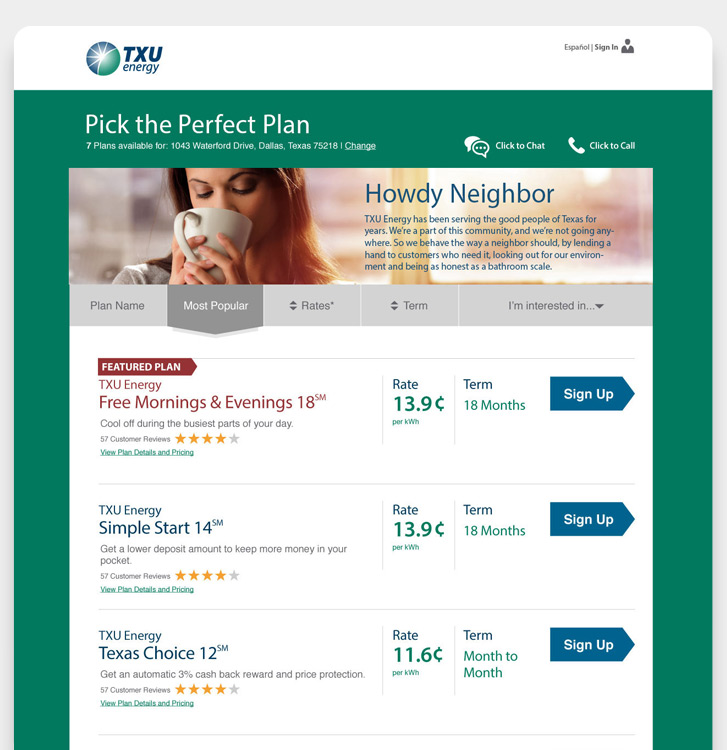
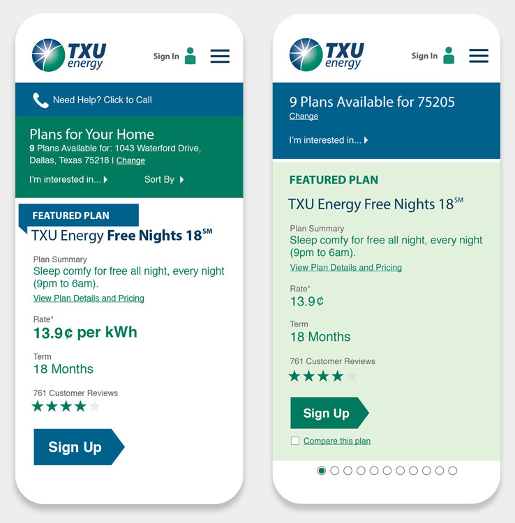
I started with an analysis of competitors’ enrollment process to capture strengths, weaknesses, and best practices. From those learnings I built high-fidelity mockups, testing layouts in various form factors with internal TXU team members. Once revisions were made, I developed clickable prototypes, and conducted numerous focus group sessions to gather insights.
.
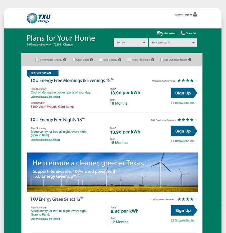
In addition to the enrollment process, I focused on creating a more intuitive, user-friendly customer interface.
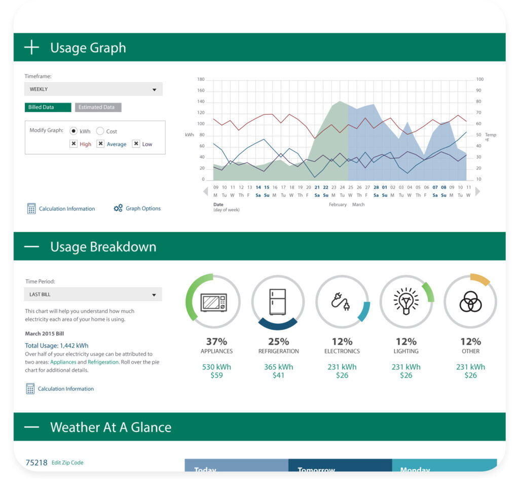
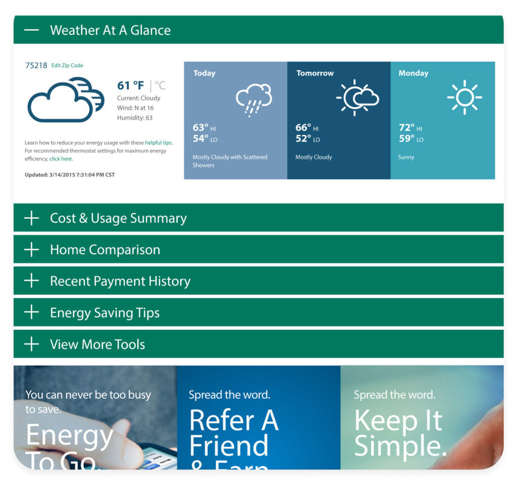
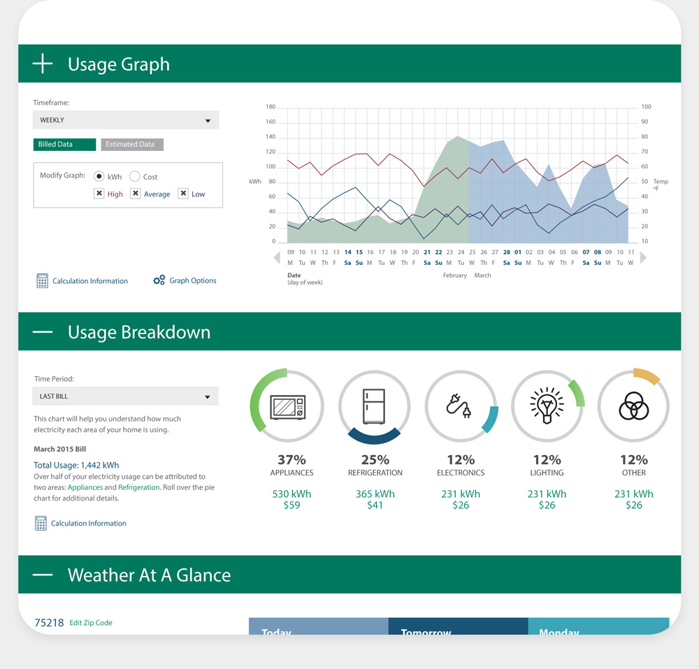
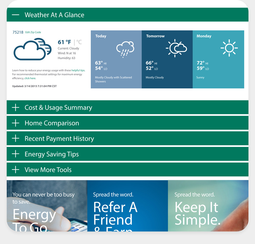
The majority of customers’ time spent on the website was inside their MyAccount section.
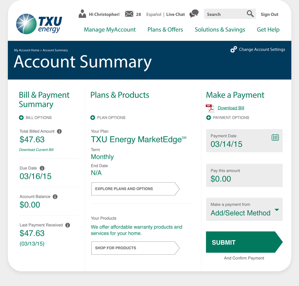
Like many utility companies, TXU’s billing and payment process was incredibly complex, and needed to be streamlined both graphically and experientially. I reorganized the billing content and moved lengthy descriptive copy inside small “information” icons.
In addition, I focused on creating a more customizable experience, allowing customers to build a dashboard featuring the content they found most valuable.
One area I could make a substantial impact was the Help Center, which data informed us had a high frequency of traffic.
To decrease the session time in this section, and to prevent users from resorting to simply call customer support, I created dynamic tiles that reorder themselves based on the customer’s most common used features.
I also used this opportunity to add specific promotions that may be of interest to the customer.